


Web design has changed. What used to take a team three months now takes a smart system a few weeks. Automation is not replacing designers. It is removing the busywork that kept them from designing.
For businesses across Houston, this shift matters more than most owners realize. A website is no longer a brochure you build once and forget. It is a working system that updates itself, adapts to context, and responds to the person viewing it. The gap between companies that understand this and companies that do not is widening every quarter.
Here is what is actually happening, and what it means for your business.
Why Component Libraries Changed Everything
The biggest shift is not visual. It is structural.
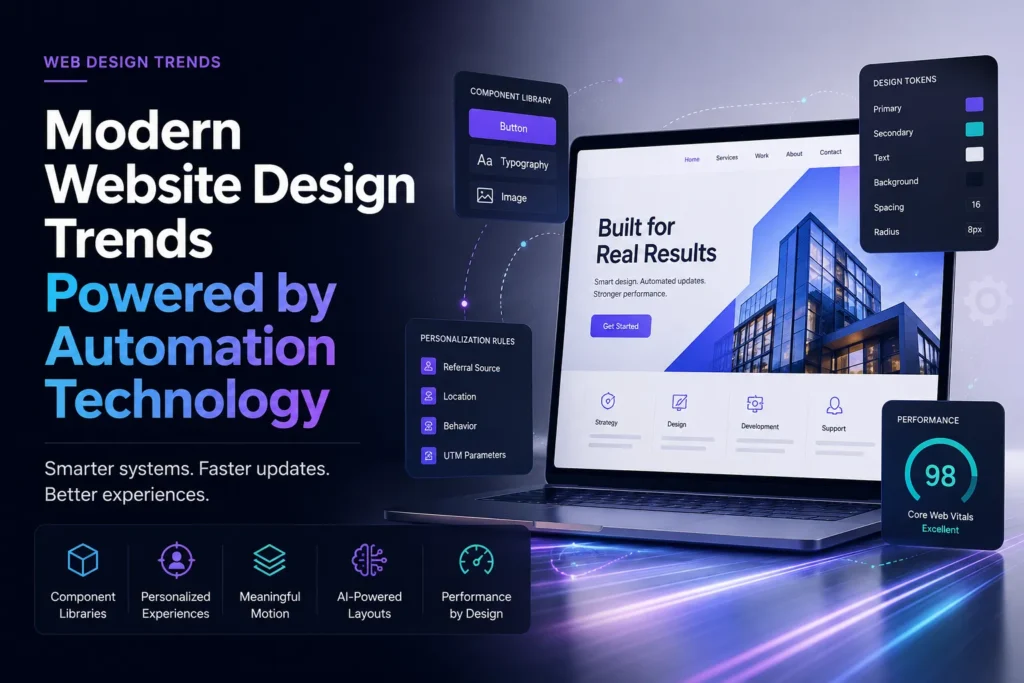
Modern sites run on component libraries. You define a button once, and it propagates everywhere that button appears. Change the brand color, and every element updates instantly. No hunting through forty pages hoping you caught them all.
Design tokens take this further. These are the raw values behind your design decisions. Spacing, colors, type scale, border radius. They now sync directly between design files and live code. A designer adjusts spacing in the design system, and the production site reflects it after review. The old back-and-forth between “here is the design” and “here is what we could actually build” is disappearing.
For a growing business, the payoff is practical. Faster launches. Cheaper updates. A site that stays consistent as it grows instead of drifting into a patchwork of half-matched pages.
Most older sites fail here. They were built page by page, each one a little different, each one a separate maintenance problem. That approach does not scale, and it never did.
Your Homepage Should Not Look the Same to Everyone
Static homepages are becoming rare among competitive brands.
Sites now detect where a visitor came from, what they viewed previously, and roughly what stage of the buying process they occupy. Someone who clicked a paid ad for one specific service sees that service front and center. A returning visitor who already read your about page sees a different call to action than a first-time browser.
This used to require an enterprise budget and a dedicated team. Automation platforms pushed it down into reach for mid-size and small companies. A Houston contractor can now show one message to a homeowner searching for residential work and a completely different message to a commercial property manager, without maintaining two separate sites.
The mechanics are straightforward. Behavioral triggers, UTM parameters, geolocation, and referral source all feed into rules that swap content blocks in real time.
But here is the part people get wrong. Personalization that feels invasive backfires immediately. If a visitor senses that you know too much about them, trust evaporates. The version that works feels like helpfulness, not surveillance. Show them the thing they came for. Do not show them that you have been watching.
Restraint is the whole game here.
Most Scroll Animation Is Just Noise
Motion is everywhere now. Most of it is bad.
Good motion serves comprehension. It shows relationships between elements. It guides the eye toward the next action. It confirms that a click actually registered. When motion does its job, users do not consciously notice it. They just find the page easy to follow.
Bad motion does the opposite. It delays the user from reading the thing they came to read. It fires a fade-in on every paragraph, so the page feels like it is fighting you. It adds parallax that serves nobody except the designer who wanted to show off.
Automation made animation trivially easy to add, and that is exactly the problem. When a scroll effect is one toggle away, people toggle it on everywhere. The result is a wave of sites that feel sluggish, overproduced, and strangely exhausting to browse.
The trend worth following is not more motion. It is motion that earns its place.
Ask one question before adding any effect. Does this help someone understand the page faster? If the honest answer is no, cut it. Your bounce rate will thank you.
There is a technical dimension too. Animation libraries add weight. Scroll-triggered effects can block rendering if they are poorly implemented. A site that looks impressive on a designer’s fast machine can crawl on a three-year-old phone over a weak connection. That is the phone most of your customers are using.
The Problem With Letting AI Pick Your Layout
Content management systems now suggest layouts based on what you paste in. Drop in three product photos and a paragraph, and the system proposes a grid, a carousel, or a split-screen block. Some tools will generate the entire page structure from a text prompt.
This is genuinely useful for teams without a designer on staff. It is also exactly how you end up looking identical to every other company in your industry.
The pattern is easy to spot once you know it. Same hero layout. Same three-column feature grid. Same testimonial slider. Same pricing table. The automation is producing what it was trained on, which is the statistical average of every site that came before.
Average is not a strategy.
Businesses that win here use automation for scaffolding and human judgment for identity. Let the system handle the grid, the spacing, the responsive breakpoints. Those are solved problems. Then have a person decide what actually makes the brand feel like itself. Photography. The voice. The one unexpected element that makes someone remember you.
The tools are good at execution. They are still bad at distinctiveness. Know which problem you are solving.
Speed Is Now a Design Decision
Core Web Vitals turned performance into a design constraint, not just an engineering one.
Google measures how fast your largest content element paints, how much the layout shifts while loading, and how quickly the page responds to the first interaction. These are not abstract technical metrics anymore. They influence rankings, and they directly influence whether someone stays.
Automated build pipelines now handle most of the heavy lifting. Images get compressed and served in modern formats. Below-the-fold assets lazy-load. Unused CSS gets stripped. Fonts get subset to only the characters you actually use. Third-party scripts defer by default instead of blocking the render.
None of this requires anyone to touch a config file anymore. It happens on deploy.
The consequence is that beautiful sites can now also be fast. That was not always true. For years, there was a real tradeoff between visual ambition and load time, and designers picked a side.
That tradeoff is mostly gone. Which means there is no longer an excuse for a five-second load. If your site is slow in 2026, it is not because good design is heavy. It is because nobody bothered.
Test it yourself. Pull up your site on mobile data, not office wifi. Count the seconds. Most business owners are unpleasantly surprised.
Accessibility Failures Get Caught Before Launch
Automated scanning now runs on every deploy at serious agencies.
The tools check contrast ratios, flag missing alt text, catch broken keyboard navigation, and identify absent ARIA labels. They run in the build pipeline, so problems surface before anything reaches the public.
This is a real improvement. The obvious failures, the ones that were embarrassing and common, now get caught automatically. A form field without a label does not make it to production.
But be clear about the limits. Automated scanning catches maybe a third of real accessibility problems. It cannot tell you whether your navigation makes sense to someone using a screen reader. It cannot tell you whether your error messages are actually helpful. It does not replace testing with real assistive technology and real users.
Treat the automated scan as a floor, not a ceiling.
For businesses serving the public in Texas, this is also a growing legal exposure. ADA-related web accessibility claims have climbed steadily, and small businesses are not exempt. The cost of getting this right during a build is small. The cost of retrofitting after a complaint is not.
Worth taking seriously before someone forces you to.
What Any of This Means for a Houston Business
If your site was built more than three years ago, it was almost certainly built as a static artifact. A finished object. Every update requires a developer. Every content change becomes a ticket. Every small fix waits in a queue.
That model made sense when websites were brochures. It does not make sense now.
The current generation is built as a system. Marketing updates content without touching code. Product changes flow through automatically. Personalization rules run in the background without anyone rebuilding a page. The site does work on its own instead of sitting there waiting to be maintained.
That is the real trend. Not a new color palette. Not a new font pairing. A fundamentally different relationship between a business and its website.
The practical question for any Houston company is simple. When you need to change something on your site, what happens? If the answer involves emailing a developer and waiting a week, you are running a system from a previous era. That has a cost, and it compounds.
Local competition is a factor here too. In a market this size, across this many industries, plenty of your competitors are still running sites built in 2019. That is an opening. Speed of iteration is a real advantage, and most businesses are not taking it.
Final Thoughts
Automation did not make web design easier. It moved the difficulty somewhere more interesting.
The mechanical work is handled now. The grids, the breakpoints, the image compression, the accessibility basics. All of it happens without a human grinding through it manually.
What remains is the part that always mattered most. Understanding who visits your site, figuring out what they actually need, and giving it to them without making them think about it. No tool does that for you. It requires knowing your customers, and that has never been automatable.
Frequently Asked Questions
Does automation mean I do not need a designer?
No. Automation handles repetitive execution. Strategy, brand identity, and judgment still require a human. The tools make good designers faster. They do not make them unnecessary.
Will an automated site look generic?
It can, if you let the defaults decide everything. Use automation for structure and performance. Invest human effort in the parts that carry the brand. That balance is what separates memorable sites from forgettable ones.
How does the cost compare to a traditional build?
Initial builds are often similar in price. The savings show up afterward, in maintenance and ongoing updates, where the difference can be substantial over a few years.
Is my current site worth rebuilding?
If every update needs a developer, if load times are poor, or if nothing has meaningfully changed in four years, then probably yes. Get an honest audit before committing to anything.
How long does a modern build take?
Less than it used to. A well-scoped site with a proper component system typically moves faster than an equivalent custom build from five years ago, because so much of the repetitive work is handled.